Wednesday, June 16, 2010

Roy Lichtenstein


I had fun with this project. i studied pop art briefly in a design class i took. i chose to do an image of a phone because most pop art is focused on making ordianry objects seem interesting. although Lichtenstein was most famous for his action comic work.

Photo Retouch


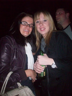
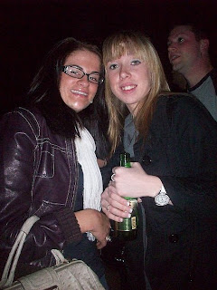
This is a very useful technique to have. Photo retouching is like magic. take away any wrinkles, blemishes, sun marks, whatever. i used a photo of my best friend Ashley and myself. the top photo is the original. on the retouch photo i took away some smile lines from myself and ashley. she also had a little chin issue that i took care of. in the original photo my bangs were parted and that always bugged me so i used the patch tool to fill them in a little. i also touched up our eyes a bit, making them a little whiter and brighter. also there was a hint of red eye i corrected.

Paul Cezanne


In this project we were to make an image look like a Paul Cezanne piece. We messed around with the hue/saturation a little, used the burn/dodge tool, and added a little blue to give it that Cezanne touch. I like the way mine turned out. although it makes the pizza look a little moldy. this is a 4 cheese pesto pizza i photographed.

Georges Seurat


I wasnt a big fan of this project. The concept and idea of it were ok. making it look like a famous Seurat painting is cool but i just dont think the results are fantastic. maybe on certain images. I actually did three different images using this technique and this is the one i thought looked the best. it was a very simple process, just messing around with the pixelation basically. again i chose a dragon for this project.

Refractive Glass


This assignment was fun! The objective was to create text and make it look as if it were glass. I think mine turned out very well. I can see myself using this technique in the future. id also like to go back and play around with different images and backgrounds to see what results i find. i used graphic design as my text image because thats my major. the background i used to fill the text with was an image of different colored marbles.

Metal Type


This project was based on using different filters to manipulate an image to make it look as if it were metal. I used my boyfriends name as the text.

Cut Paper


I actually really enjoyed this project. I used an image of my manager Jessica. Its kind of the same concept as the previous project (outline and fill). it makes the image look cartoonish but at the same time its meant to look as if you pieced a bunch of paper together to create an image. we also added a drop shadow effect to give it that extra piece by piece looking feel so it wouldnt look so flat.